Colors of Influence in Marketing
Posted on November 1, 2023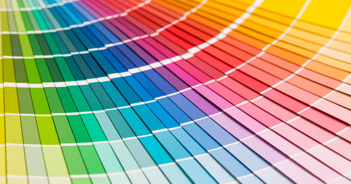
Marketing is sometimes referred to as an art of persuasion, and retailers can rely on the use of colors to influence their customers in their buying decision. Color not only increases the appearance of advertising, but also raises your brand’s recognition.
Red has a tendency to increase appetite and evokes passion and alertness. It’s used to attract impulsive shoppers or hungry patrons and demands attention.
Orange reflects excitement and warmth and, like red, grabs the attention of impulsive shoppers. It represents fun, good value and affordability. Sales and good deals will sometimes be printed on orange paper.
Yellow represents optimism, youthfulness, and clarity. Kids and infants tend to be drawn to this color the most so it’s a good choice for toy ads. Too much yellow; however, may create anxiety.
Green signifies new growth, wealth, and eco-friendly. Like blue, it also has the tendency to evoke relaxation and is used to create an inviting atmosphere.
Blue is preferred by men and symbolizes calmness, peace, trust, and loyalty. It can also enhance productivity and confidence. Some banks use blue to enlist your trust that your finances are safe with them.
Purple is the color of royalty, wisdom, and creativity. It is ideal to create a feeling that a product is luxurious and stands for success. It’s also widely used in the creative industry to spark one’s imagination and gives a feeling of mystery, and fantasy. Too much of this color might be considered distracting though.
Black symbolizes professionalism and sophistication. It can signify high-end or elite status when used in packaging, but too much can be interpreted as negative and oppressive. It’s a preferred color for brands that wish to be international due to being widely recognized.
White is neutral, pure and clean. It’s mostly used to separate elements and give a feeling of openness rather than crowded or busy. White space gives the mind a chance to rest between receiving information and works as a good contrast. Ad messages surrounded with white areas are the most clear.